Series Edition: Section 1 - The Basics

Why Your Emails Might Be Going to the Spam Folder
A Stat That Should Scare You
The thing is, 1 in 6 actual emails never makes it to the inbox.
Not spam, not wrong addresses, actual emails from actual companies to actual people who opted in to receive them. Poof, gone!
If you've ever sent 1,000 emails in the past month, you've probably already lost 170 of them to the spam folder or bounced before anyone ever sees them. If you've ever sent 100,000 that's 16,900 emails that no one will ever read.
And the worst part is, you probably don't even know it's happening!
Most people look at their email reports and they say, "Sent: 10,000 | Delivery Rate: 99%." But that 99% "delivered" rate doesn't tell you if they were delivered to the actual inbox or the actual spam folder. That's two totally different results.
So... What Even IS Email Deliverability?
Email deliverability is a simple idea, but messy in practice:
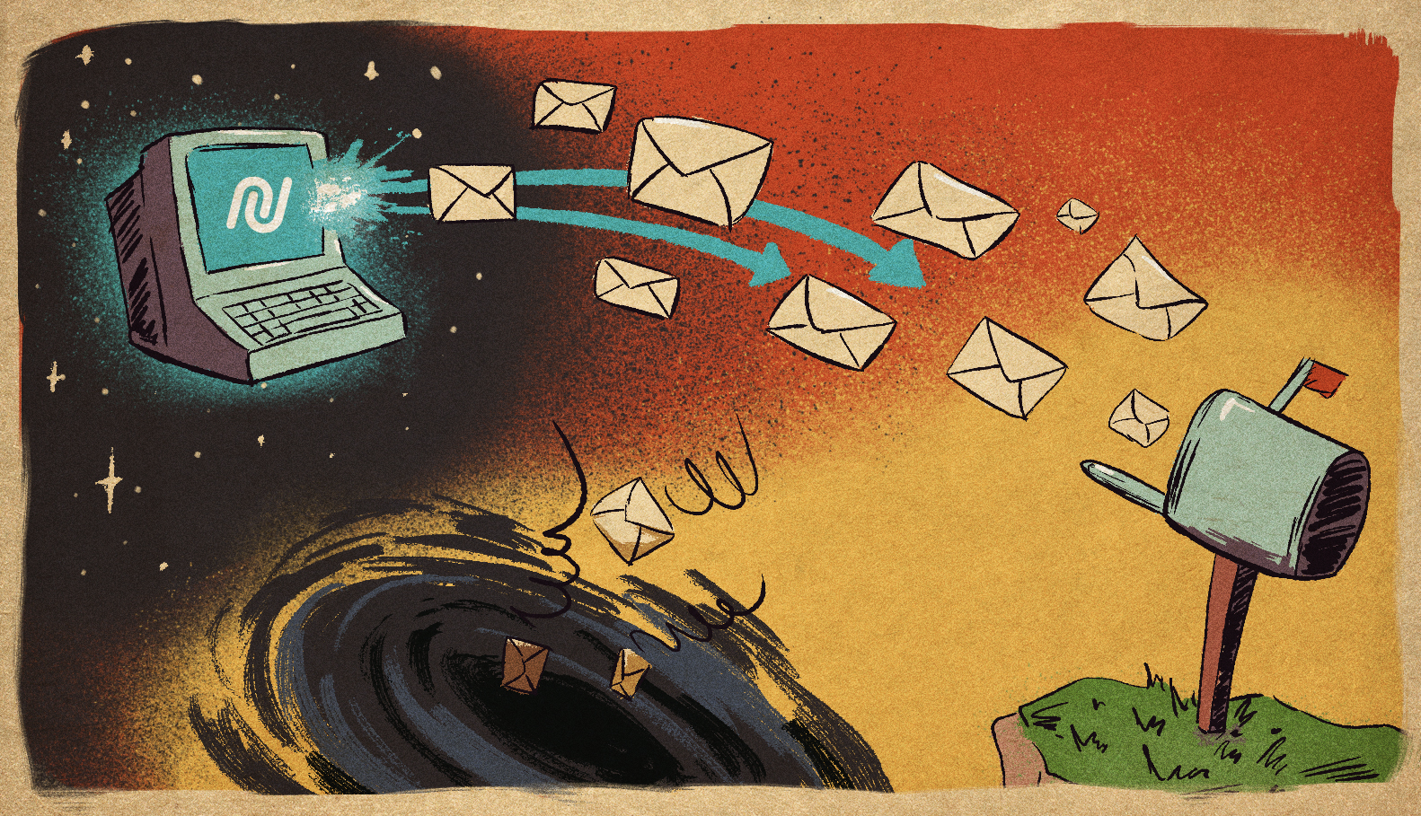
It's the question of whether your emails actually show up in people's inboxes, not spam folders, not promotional folders, not nowhere folders.
That's it. That's the whole idea.
Deliverability is not about getting your email out the door from your server. You can send an email with no problem, but it can end up in a spam folder. Deliverability is the difference between "sent" and "seen."
Here's a way to think about it:
Sending an email is like putting a letter in the mail. Deliverability is like getting it delivered to the doorstep, rather than the junk mail heap.
Deliverability vs. Inbox Placement: What's the Difference?
This is where a lot of confusion happens. These two terms get used interchangeably, but they're not the same thing.
Metric | Email Deliverability | Inbox Placement |
Definition | Whether your email is technically delivered to the mail server without being rejected (bounced). | Whether your email actually lands in the recipient's primary inbox (not spam, promotions, or tabs). |
What It Measures | Technical acceptance by mail servers. Bounces (hard/soft). | Success with spam filters. Whether algorithms let it through. |
Typical Rate | 98-99% (if your list is clean) | ~83% (industry average) |
The Trap | You think you're winning. The email reached a mail server, so it's "delivered." | But it's sitting in spam. Nobody sees it. No engagement. Lost opportunity. |
So, here’s the real talk: a 99% delivery rate means nothing if only 75% of those emails get into the inbox. You’re celebrating your emails making it to the mail server while your revenue opportunities are in the spam folder.
Why Should You Even Care?
Because it impacts your business in three ways:
1. Revenue loss before anything else happens
If 17% of your emails don't make it to your customers' inboxes, that's 17% of your sales, customers, sign-ups, or engagement that just... disappears. Before they even see your email, before they decide to not buy from you, before anything, and nothing happens. That's money on the table that you'll never see.
2. Your sender reputation gets damaged
ISPs (Gmail, Outlook, Yahoo, and so on) monitor your email performance. If people are ignoring your emails, deleting your emails, and marking your emails as spam, an ISP will be thinking: "This email sender is not trustworthy." And the worse your reputation gets, the stricter their spam filters will be on your emails. So, your best emails will end up in spam because an ISP already determined that you're a suspicious email sender.
3. Trust is lost, and it happens quietly with each unseen email
Your customers will unsubscribe from your emails because they never see your emails in their inboxes. Your open rates will be terrible. Your team will wonder if email marketing is even working anymore. Meanwhile, email deliverability is quietly slipping under the radar.
The Chaos Part: Dozens of Systems Are Judging Your Emails
Here's where it gets crazy.
Because when you hit "send" on that email, it doesn't go directly to that person's inbox. Before that happens, it has to go through dozens of invisible checks and filters, all at the same time, all with different rules.
Gmail's got its own algorithm. Yahoo's got its own rules. Outlook's got its own rules – and they're all totally different. And then there are all the authentication systems like SPF, DKIM, and DMARK (don't even get me started on those).
Then there's your reputation score as a sender, and your domain's reputation score, and how many people are actually engaging with your emails, and whether or not you're accidentally sending spam keywords in your content...
And that's still not even all of it.
Each one of these email providers has its own way of doing things, its own way of weighing all these different variables and determining whether to deliver your email.
It's chaos. Beautiful, algorithmic, invisible chaos.
But here's the good news: it's not random chaos.
There are patterns and rules and things that you can control.
And that's what this whole series is about.
The Real Question
Before we delve deeper into who and what is responsible for checking your emails, ask yourself:
Do you know what percentage of your emails actually land in the inbox today?
Not sent. Not delivered. Land in the inbox. Where actual humans can see them.
If you don't know the answer to this question, it's totally fine. You're not alone. Most teams don't track it until something goes wrong. But the space between "sent" and "seen" is where all your problems reside.
In the next section, we'll be introducing you to the unseen actors in your email's journey: the ISPs, spam filters, authentication protocols, and algorithms working together to determine your email's fate.
Spoiler alert: it's going to change everything.
Key Takeaway
Email deliverability is the space between sending an email and it arriving in someone’s inbox. The sad truth is that 1 in 6 legitimate emails never makes it to the inbox, which means revenue and engagement are slipping through your fingers before you ever get a chance to engage with them in the first place. And it’s not because of any one thing, it’s a system of invisible checks and filters all working together to pass judgment on every single email you send. The good news is, it’s all based on a system of rules, and understanding them is the first step to winning at email.
Start sending emails today!
Already a Nucleus user? Visit your Nucleus Resource Library for more!